Process – Conducted ideation workshops and distributed questionnaires to collect feedback from existing readers and understand audience expectations. – Analyzed insights to identify the most requested features and necessary improvements for the user experience. – Designed wireframes and mockups focusing on intuitive navigation, easy access to information, and clear content, while integrating advertising constraints. – Built a design system based on Atomic Design to ensure visual consistency and streamline development. – Adopted a mobile-first approach to align with the habits and needs of the target audience.
User Space Redesign
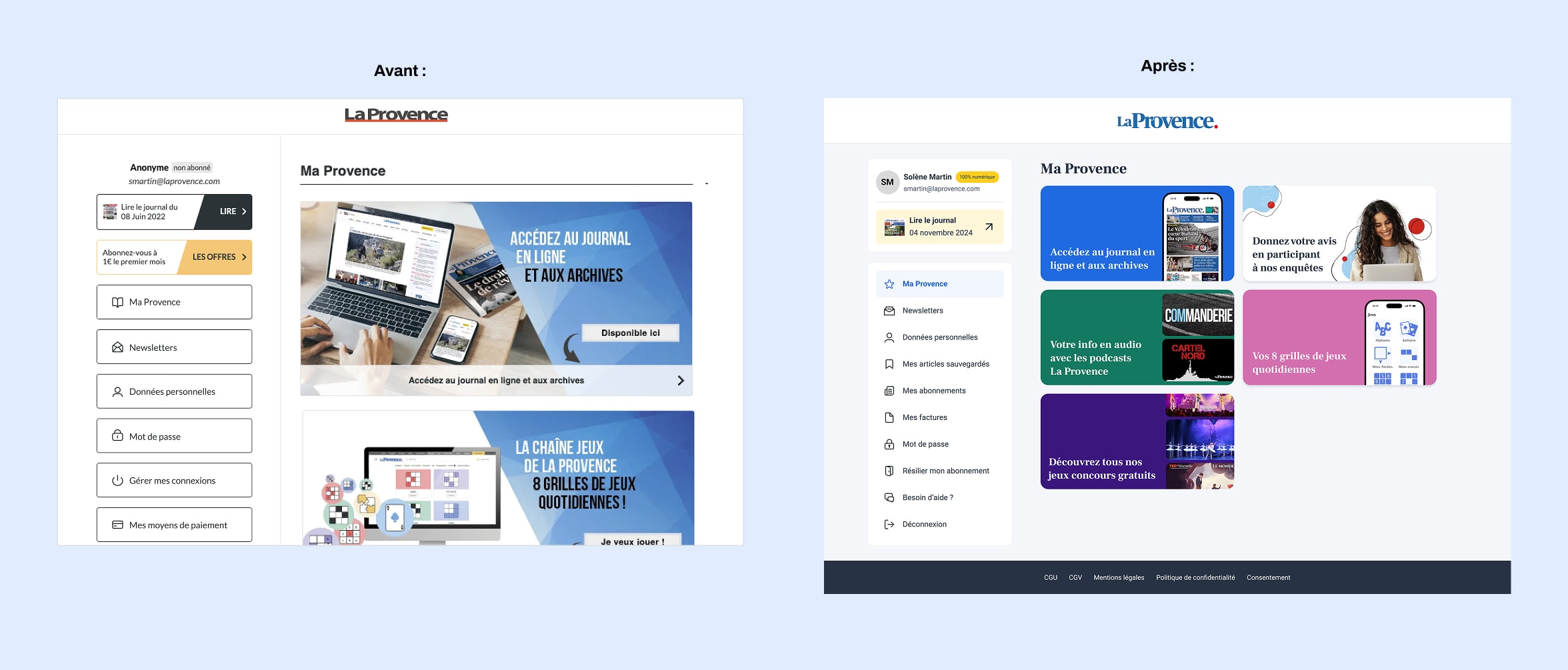
The goal was to make the user space more intuitive and autonomous. After analyzing the existing platform and identifying pain points, we redesigned the structure to improve clarity, added key features such as saved articles, invoice history, payment management, and subscription updates, and refreshed the interface to align with the new brand guidelines.
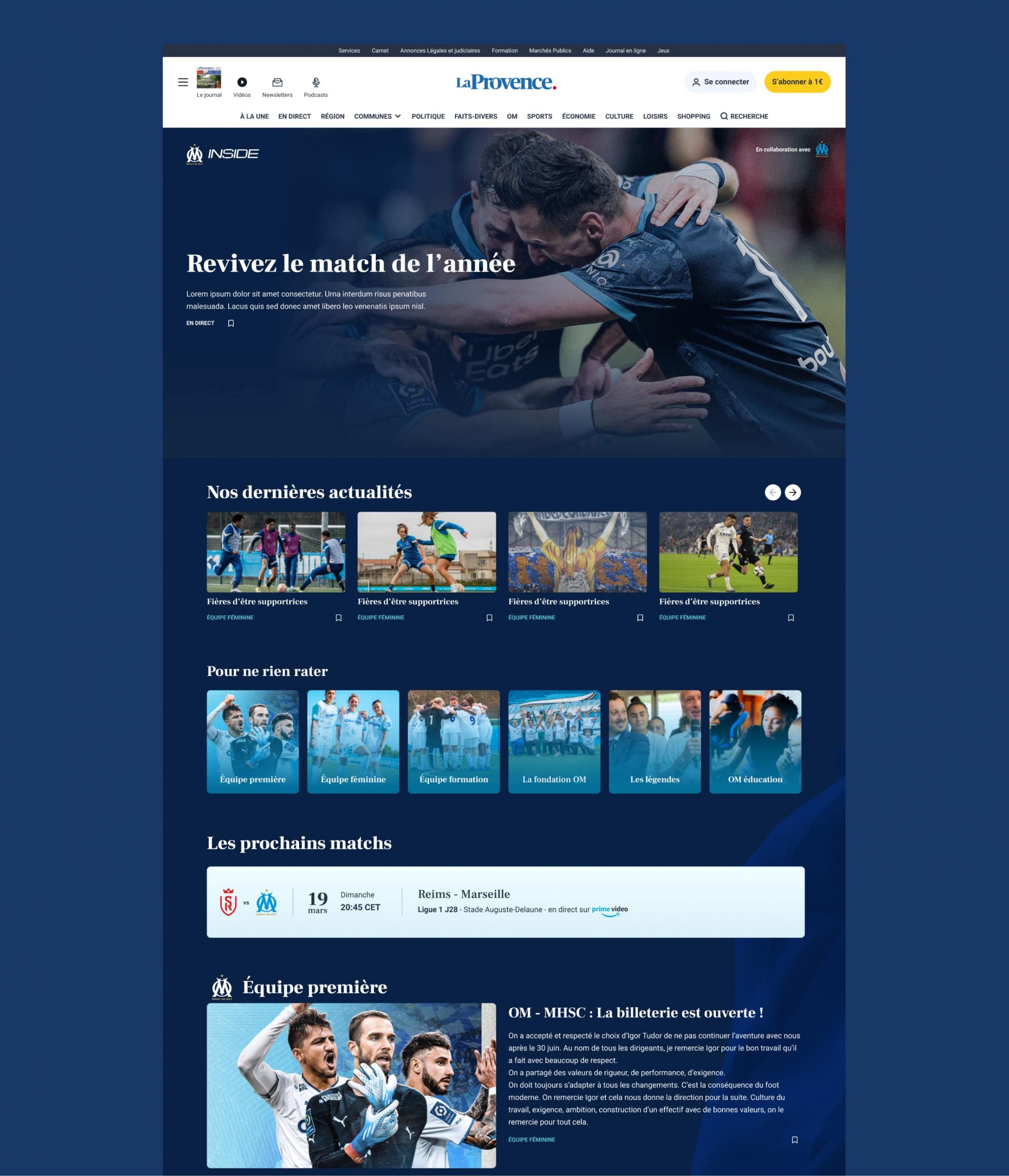
Creation of the OM Inside Universe
Design an immersive experience centered on the world of Olympique de Marseille, while visually and structurally distinguishing it from other sections of the La Provence website. Define a dedicated visual identity inspired by sports and OM branding, featuring immersive visuals, a tailored content hierarchy, and smooth, intuitive navigation.
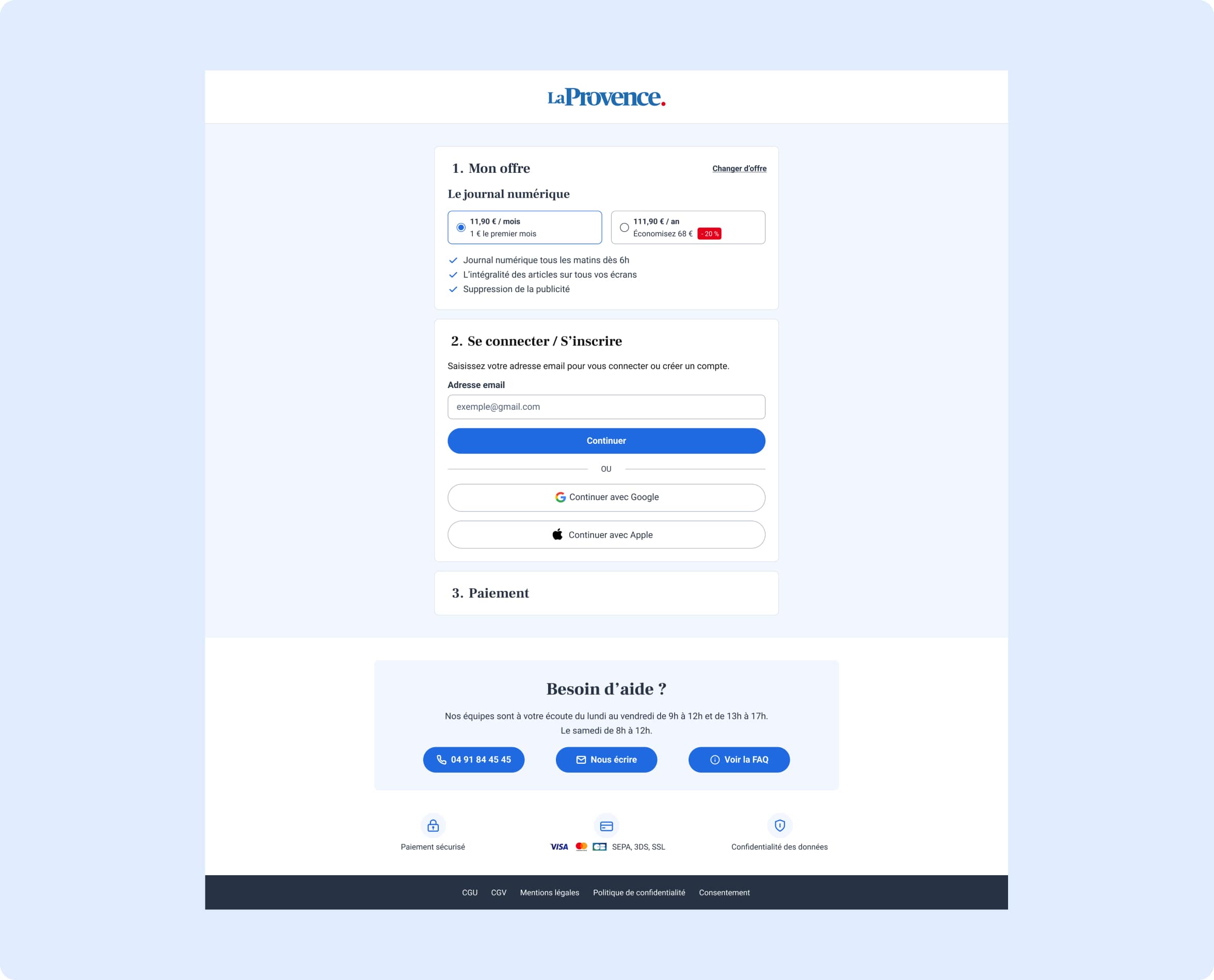
Redesign of the Subscription Funnel
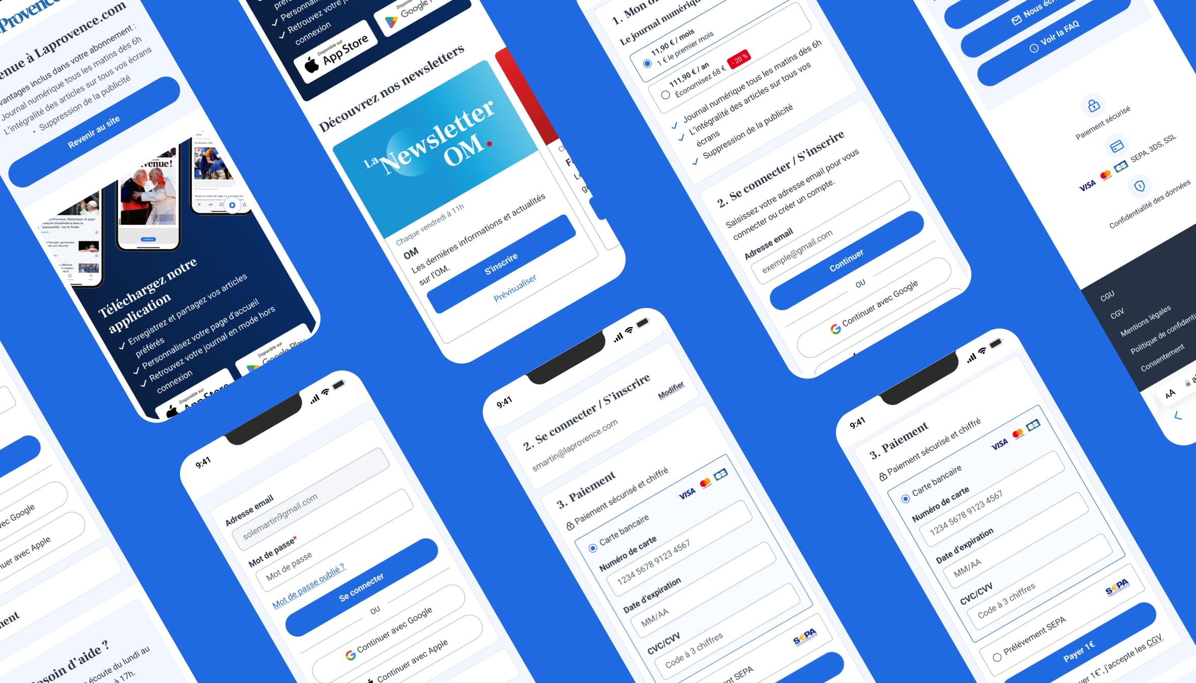
We redesigned the subscription funnel to make it more intuitive and seamless. Main objective: reduce friction points and simplify the user journey as much as possible. The new process is designed to take place entirely on a single page, divided into three clear and distinct steps, allowing users to stay focused and easily track their progress.
An automatic detection system has also been implemented on the email field: it identifies in real time whether the user already has an account and adjusts the next step accordingly (login or account creation), all without interrupting the navigation flow.
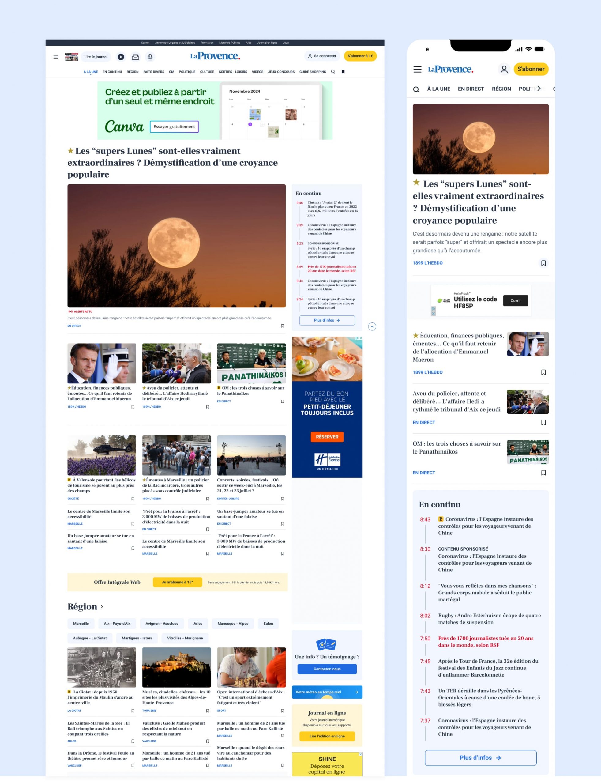
Homepage Redesign
The redesign of La Provence’s homepage aimed to modernize the interface while improving content readability and hierarchy for users. Key decisions included removing the top-of-page carousel in favor of a more static, impactful main articles block, better suited for mobile usage. To structure the content, clearly defined categories were introduced, guiding users through the page and helping them easily find content that interests them. We also optimized the placement of advertisements, particularly in the right-hand column, to prevent disruption of the reading experience while meeting visibility requirements for the ad team. Finally, careful attention was given to delineating content blocks, creating a smooth, harmonious flow and a more comfortable continuous reading experience.